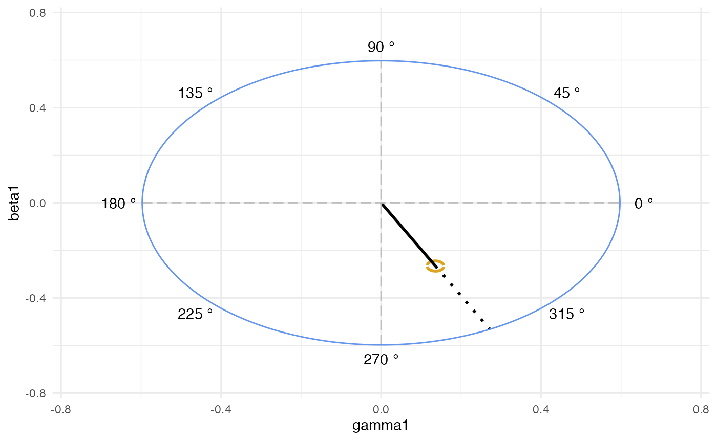
This is a ggplot-styled graphical representation of the ellipse region generated by the cosinor analysis. It requires the same data used by cosinor model to be fit with the model cosinor. This includes the amplitude, acrophase,
This is a ggplot-styled graphical representation of the ellipse region generated by the cosinor analysis. It requires the same data used by cosinor model to be fit with the model cosinor. This includes the amplitude, acrophase,